Tuesday, November 18, 2014

Where?... What?

Space Planning


Planning your space is a task that takes time and commitment. It can be a draining part of a remodel but the end result will be worth it. When you make the engagement to plan the space you will end up with a space that is efficient,fits your daily needs and flatters your visual eye. 


Lets start the process:


1. Space needs  


  1. Whats the space going to be used for?
  2. Who will be primarily in the area? Kids, large families, clients? 
  3. How many people? 
Answering these questions will help you figure out what size of a room and furniture fits  your lifestyle and what the objective of the space is. 

2. Space relationship 

Next you need to plan the flow of your spaces, what areas have to go where. 

 What spaces need to be next to each other?

For example: You want to place the dinning table next to the kitchen, because the food comes from no other place than the kitchen. It wouldn't make sense to place the dining room down the hall. It is unpractical to be hustling dishes between spaces.  

3. Current conditions 

Observe and study the spaces current condition. Adapt your plans to what exists. 

4. Space paths

Its important you remember to observe how your spaces will allow people to travel. Commemorate that you need about three feet for people to have a walking path

5. Furniture grouping 

Think about your furniture grouping; a bedroom has a bed, side tables and lamps. Its important you have similarities in your groupings. Think about spacing between the individual furniture pieces and the relation they have. 

6. What spaces are private or public?

Furniture placement can transform a public space to a private place. Its important you look through your spaces to decide what areas you want private or public. 

7. Paper time

Its finally time to start putting your ideas down on paper. Start sketching your ideas using your documented observations. 


How does this relate to Eclectic Style?


No successful space goes without planning. Its important with elaborate styles such as eclectic you put a lot of planning and commitment behind it. 

My Design

Mobile - ομορφιά

ομορφιά= beauty in greek


How did it start:


Two weeks ago, to this day I was assigned a creative project titled "Mobile"  in Design Theory class. The task was to build a hanging mobile that displays your concept, any concept. Only catch, you couldn't showcase a mobile that expresses your concept literally. 

What's my concept?


What first came to my mind was the Golden mean. You may ask what the Golden mean is? It is the ideal moderate position between two extremes. This repeating ratio through out the world is everywhere you look in nature, art, animals, humans and architecture. So I wanted to combine two elements: beauty and the golden mean. First, I needed to find a relation between the two. I did some research and discovered that the Greeks considered the Golden mean as beauty. Beauty to them consisted of three things: proportion, harmony and symmetry. 

What objects in nature represent these three words? 

I choose:

Proportion- golden spiral seashell 


Harmony- Tree+Dirt 


Symmetry: Beehive


Materials:

- 19 gauge sliver wire
- 24 gauge copper wire

Final Result 


How does this relate to Eclectic design?


This project/post doesn't directly relate to Eclectic design. It does showcase that it is important to step out of your comfort zone and push through those design road blocks.  

Pattern


    The Do's and Dont's of Pattern in            Interior Spaces


Let's discuss some of the most common patterns in the interior: 


Complex Patterns: Visually busy to the eye; variety of colors, lines and shapes. In appropriate dosages it can bring a space alive. You generally want to use them in large spaces. When you have a confined space with a complex pattern it can dominate the area. 


Vertical Line: Bring energy to the area and move the eye level upwards making a space look taller. Vertical lines can also represent elegance.


Horizontal Line: Create a relaxing environment with the ability to lower the height of the room. 


Floral: Florals make a space delicate and girly. Use the rule of thumb; the larger the space, the larger the print, the smaller the space the smaller the print. 


Motifs: A random repeating pattern commonly based on organic shapes. Group the same pattern throughout spaces to create a wide open plan. This creates common ground between rooms, allowing the areas to effortless flow one to the other. 


Animal Prints: The pattern for those that want to walk finely on the border of edgy and tacky. Use the print as the focal point. Choose one area or object to have it and stick to it. It's easy to overwhelm a space with animal print. 


Scale + Density 

It is very important for your patterns to complement one another. It's all about the scale and density. 

Scale: The size of the of the elements/objects in the pattern. 

Density: How close or often the elements are being repeated. 

For example:

If you are planning to use two different types of wallpaper in your office, you first need to observe  what one has bigger scale and density. The wallpaper with the larger elements and placement further form one another should be used more than the other pattern. The busy wallpaper should be used as an accent to the office space. This creates a balance between the two and gives the eye visual interest without overwhelming. 

How does this relate to Eclectic style?

From my last blog post you learned about texture, today you learned about pattern. These elements are the two primary keys for a successful eclectic space. Eclectic spaces are notoriously known for mixing a variety of patterns. 

Texture

Don't forget about that... Texture 


 What is texture in interior spaces?

The surface quality of a material. Any surface has a texture, varying from smooth, rough, soft, fluffy or bumpy. Texture can be described in two ways; tactile or visual. 

Tactile texture: the actual feeling of a surface 

Visual texture: is your perception, what a material may feel like. 


Why is texture in interior spaces important?


It's the opportunity to add subtle or powerful dimension to a space. You can determine the areas atmosphere by adding texture. Texture is the best way to differentiate various objects, surfaces and scale. You can communicate a design style further through your texture. 

Texture Weight 

The primary principle of texture is weight. A woolly area carpet is going to associate "heavier" than a linen carpet. The woolly carpet material appears thicker which affiliates with a heavier weight. A smoother material is thinner which appears and feels lighter. You can balance furniture pieces using different weights of textures. To scale down a over sized couch you can incorporate throw pillows using light materials, with smooth textures. 

How does texture relate to Eclectic style? 

Texture relates to Eclectic as much as any other interior style. Incorporating a variety of textures in an Eclectic style is a necessity for a successful outcome.  

Saturday, October 25, 2014

Showcase- Interior Designer: Jamie Drake  


This week on my blog I'm showcasing a interior designer that I admire, Jamie Drake. You will often see he's work in design magazines, which is how I originality discovered him.

Introduction: 

Drake is known to infuse traditional spaces with contemporary elements, creating engaging spaces; he stated, "there is little that doesn't inspire me." He is blessed for creating modern spaces yet inviting by using bold colors and decor. Drake designs commercial and residential spaces as well as furniture, rugs, fabrics, appliances and art. 

Bio: 
- Jamie Drake is a New York based designer who believes that the best decor expresses personality and place. 

- He designed some of the countries most luxury spaces such as: Gracie Mansion for Michael Bloombery, Madonna's LA home and  New York City Hall. 

-Jamie Drake has mastermind:
  • Rug collection for Roubini and Safavieh
  • Furniture line for Lewis Mittman 
  • Bath room fixers for THG 
  • Fabrics for Schumacher
  • Sinks for Elkay 
  • Bath accessories for Labrazel
  • Light Fixtures for Boyd Lighting 
  • Furniture line for Theodore Alexander 

-Drake has received honors including: 

  • 2013 Fashion Group International Night of Stars Award for Interior Design
  • 2013 Decoration & Design Buildings Stars of Design Award 
  • 2003 Triple Crown: Interior Design Magazine, Interior Designer Hall of Fame 
Photos of his work: 


http://www.housebeautiful.com/decorating/interior-designers/famous-interior-decorators#slide-4

Friday, October 24, 2014

• Inspiration •


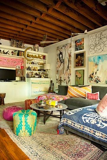
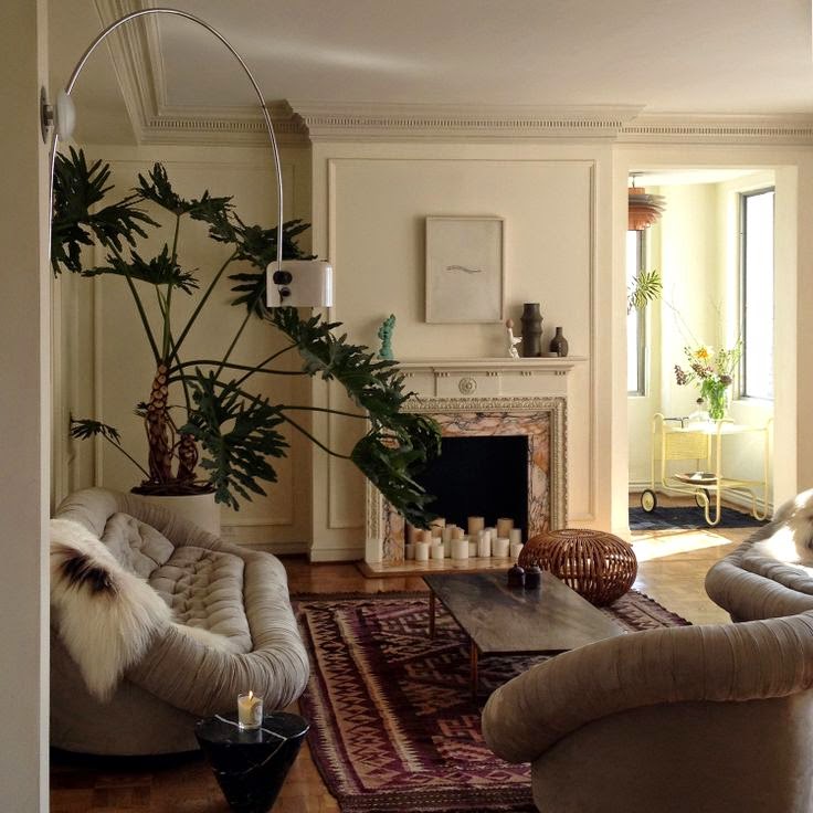
Today's blog post is going to be more visual than "reading material". Eclectic design is all about grabbing inspiration from different styles, time periods and cultures. My first step when hunting for inspiration is Pinterest. Pinterest is a website used as a visual discovery tool. It is a great source for any future project ideas or an inspirational pursuit.  Next stop for inspiration, magazines. I typically look through any design magazines I have laying around at home. They are a great source to find a variety of styles and ideas for future eclectic projects. Design magazines often showcase interior designers and architects representing their style.  This is a great way to discover new designers. 

My favorite magazines include:
-      -Dwell
-      -Architecture Digest
-      -Interior Design

My last source of inspiration is exploring spaces. You can take ideas for your designs from your everyday life. The commercial and residential spaces you see every day can be a great source. You can first hand see what works and doesn't work. I personally love to visit and stay in luxury and boutique hotels to indulge in the culture and design of the spaces. 

I also like to explore spaces such as:
-museums 
-retail stores 
-restaurants
-furniture and decor stores/boutiques 

Below are some images from Pinterest that represent eclectic style: 


Thursday, October 23, 2014

New Bedroom- Transformation

  • Spring 2014Eclectic Style •


This past Spring I acquired myself a new bedroom, on our first floor. My first bedroom was on the top floor, smaller square footage, smaller closet and no bathroom. The new space was a blank canvas; dry walled and primed. Let's blast to this past spring and overview my bedroom transformation. 

Step 1: Creating the color palette 


The walls were white and the floor is tiled; sparkly grey, large rectangular tiles. I wanted the walls and furnishings to consist of a neutral palette; white. I would add color and texture through decor. 


* These images display bedrooms using a white palette. They used a variety of white's too add depth and interest to different aspects of the space. I used these images as initial inspiration though had aspiration to add color in the decor. *


All these images were sourced from: http://designkastle.com/2012/12/white-color-scheme-modern-contemporary-bedroom-designs/


Step 2: What I need/Want for the space 

My new room shape represents a cube. The space is large, with plenty of natural light provided by the single long rectangular window. Two of the four walls has a sill to add visual depth to the space. First, I created a list; what I needed in my bedroom and what I wanted. 

What I needed:
1. Bed 
2. Wardrobe 
3. Chest of drawers 
4. Side table x 2 
5. Floor Lamp

What I wanted: 
- Wall decor 
- Hanging fixtures 
- End of bed bench 
- Extra chest of drawers 
- Vanity 

Step 3: Planning the Space 


• Inspiration •
I wanted the focal point of my bedroom to be my bed. The rest of the furnishings would be sensibly placed around it. 

http://www.interiorexteriorideas.com/wp-content/uploads/2014/02/window-focal-point.jpg

I should first mention that the wardrobe had an automatic placing, the same wall as my door. This wall has a section that is 5 inches deeper than the rest. That section of the wall was ideal to place a ceiling to floor wardrobe with considerable depth to it. When walking through my bedroom door, the first wall you see is where the bed is placed; the back wall to the right of my wardrobe. The bed frame is placed in the center of the wall and is accompanied by side tables on either side. The side of the bed I favor is where I placed a floor lamp, for optimal reading light. 
I hope that any women can agree with me that no storage is enough. The solution to neatly store my ridiculous amount of clothing was to have a wardrobe and two dressers. The largest dresser would be placed on the opposite wall of my bed, centered to the bed. The smaller dresser was placed on the left side of my bed next to the side table. 

Step 4: Sourcing the furniture 

Now that I have planned the space, it was time for shopping, something that everyone 
(or just me?) looks forward to. It was time to do some exploring to find what fit the spot for each individual piece. Below is a list; what furnishings I bought and where I got it: 

     1. Bed frame: Ikea  + DIY Headboard 


      http://www.houzz.com/photos/256528/HEIMDAL-Bed-frame-modern-beds

2. Large Dresser: Ikea 


    3. Side Tables: Pier 1
      http://www.polyvore.com/pier_imports_hayworth_table_silver/thing?id=66596767

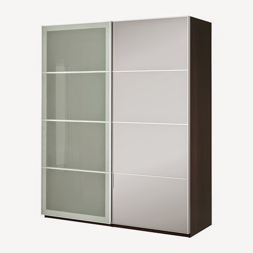
     4. Wardrobe: Ikea 
(this style, but all white) 
      http://www.ikea.com/ca/en/catalog/products/S09029240/

    5. Smaller dresser: DIY Project 
     
    6. Floor Lamp: Ikea
    http://www.ikea.com/ca/en/catalog/products/00190830/

    7.White Vanity: InForm (vintage, can't remember designer name) 

The decor and final finishings were bought overtime from selected stores such as Anthropology, Kate Spade, Winners, Homesense, Antique Shops, Local Boutiques and Target. 

Here are some images of the finished project: 


Vintage Dresser- DIY Project 

Kate Spade- hanging tissue balls
Large Ikea dresser complemented with a variety of decor pieces.